Niche Rebrand

Brand Evolution is the term we use to describe updating our branding without a complete overhaul. We want to leverage the equity that we have in our current branding, but evolve to a fresher look that is relevant to our audience. Our evolution looks at the brand as a whole; internal, client and user. I apologize in advance for the long scrolling. This project had many moving parts to it, so things may get a little messy.
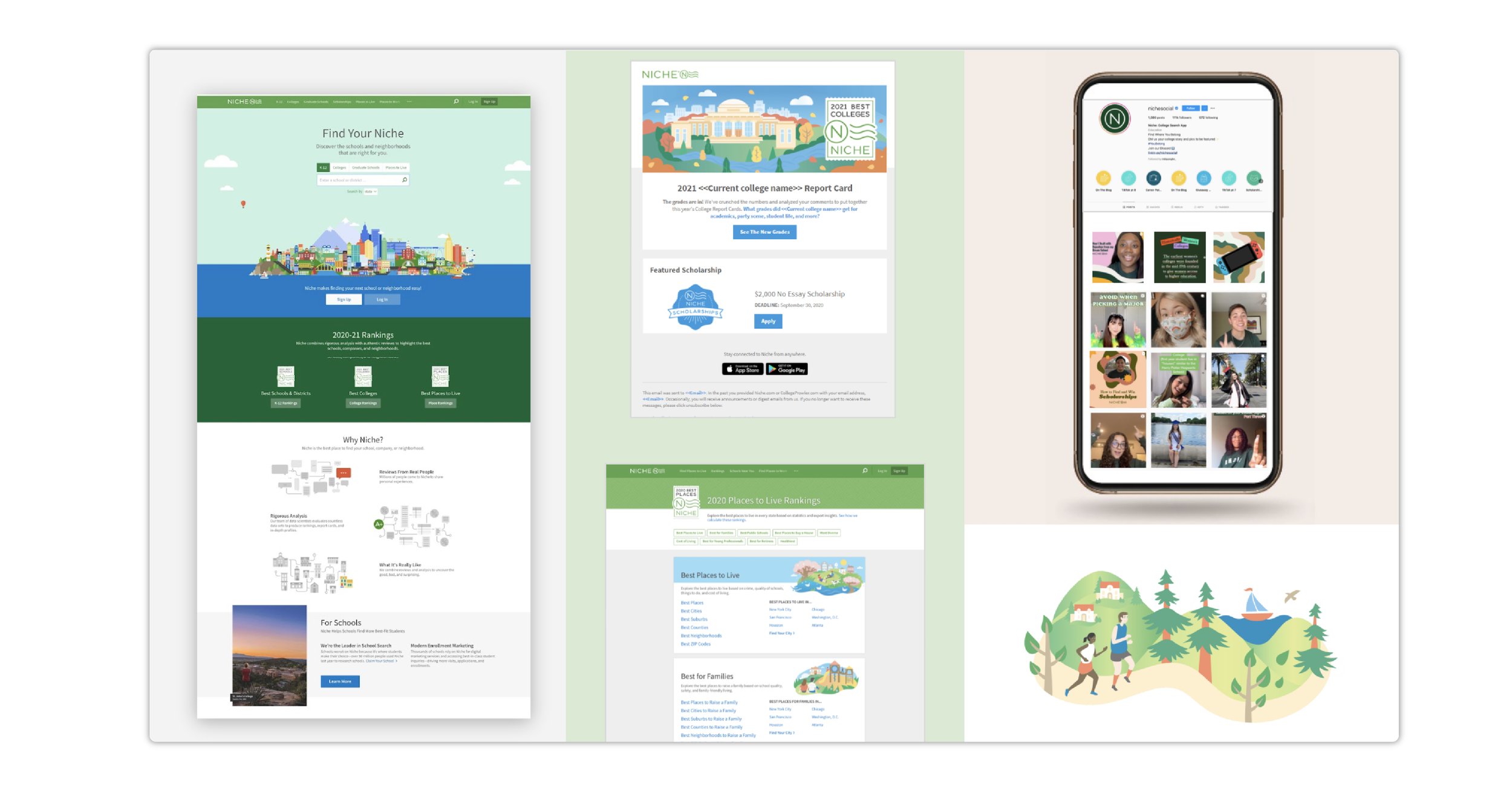
The images below are our from our previous brand style. There are a few reasons why we decided to upgrade.
Position ourselves as a challenger brand in the education space – with a focus on the student
Update our brand visuals to be relevant
(again thinking about the current high-school student)Unify our product and our brand image
Improve our processes and scalability
Help new employees understand our brand and the thinking behind it
Keep up with the times (and our ever-changing audience)
Our current brand was deemed “childish, outdated, and a bit cheesy”

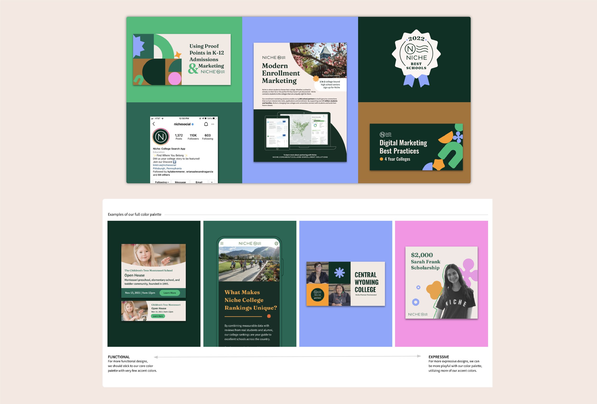
Below are snapshots of where we ended up with our final brand design, assets, colors, and voice.
The Niche Audience is ever-changing. We need to appeal to new students, parents, and school administrators in a way that instills confidence to all. To create a brand that is visually appealing to such a wide audience, we must create a visual language that is both sophisticated and playful and must be adaptable based on the audience. Our new creative expression is built with flexibility in mind and grounded in the education space.


I’ll go a bit into the brand redesign process below…
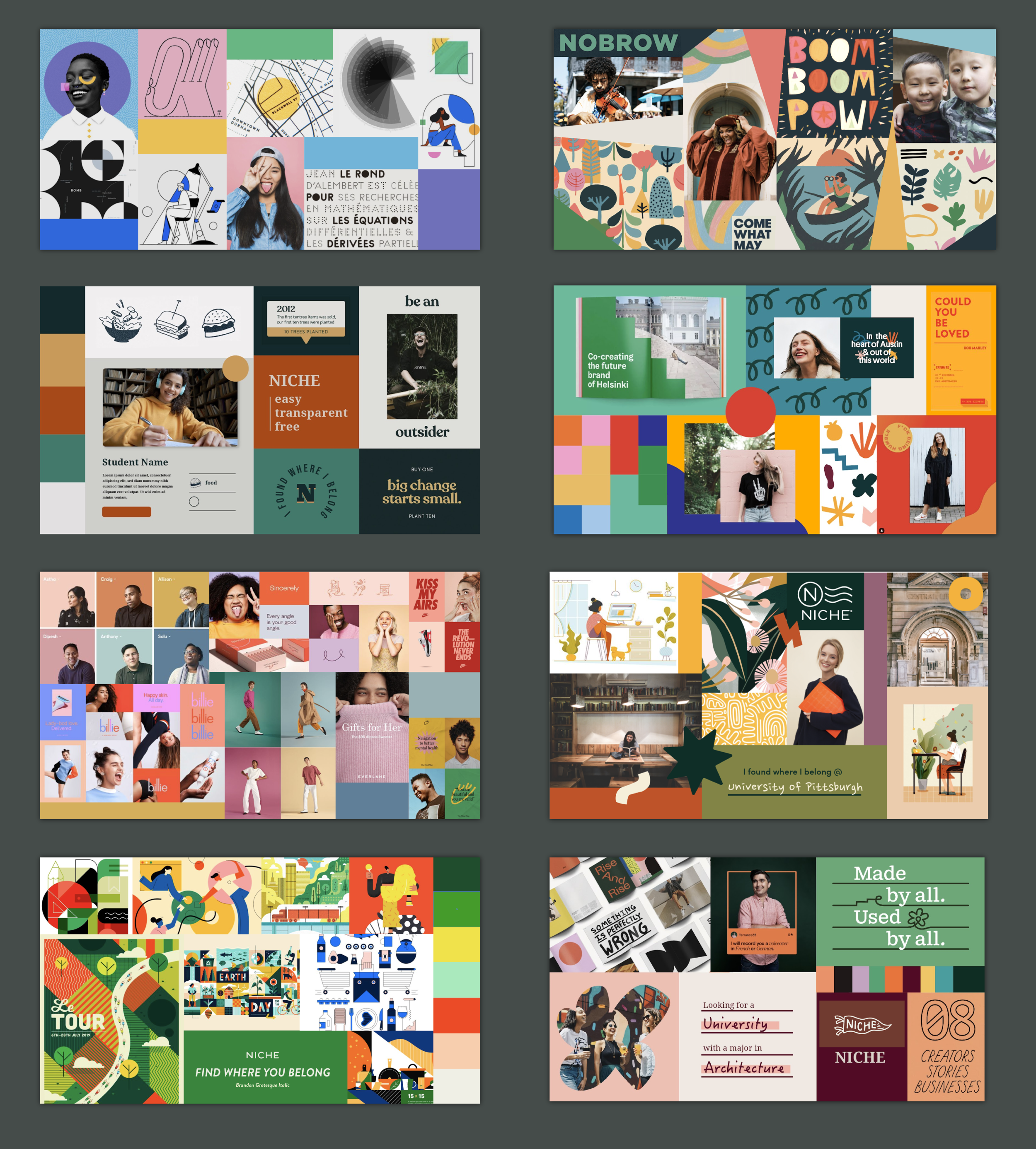
Moodboards, moodboards, moodboards
This was the longest part of the process for the brand redesign. What did we want our brand to look like? How did we want it to feel? How will we connect with our younger audience and also our B2B side. Each member of my team ( our creative director, motion graphics designer, a senior designer, and. myself ) created many iterations of moodboards. We spent weeks, probably months working on these. Keep in mind, the design team was working on other projects and keeping up with our normal tasks in addition to redesigning the Niche brand.


Next we began to break down some of the moodboards into their basic elements.

We picked out some of the directions we liked and played around with mock ups to give us an idea how these would work (or not work) on our actual site.

Finalizing Our Brand
During all of this we polled our entire company on options they liked, and on their thoughts of our current brand to get our own employee insights. We also outsourced to do larger testing once we narrowed down a final few directions. This led to our final design choice, and from there we narrowed and honed the style into what we have today.


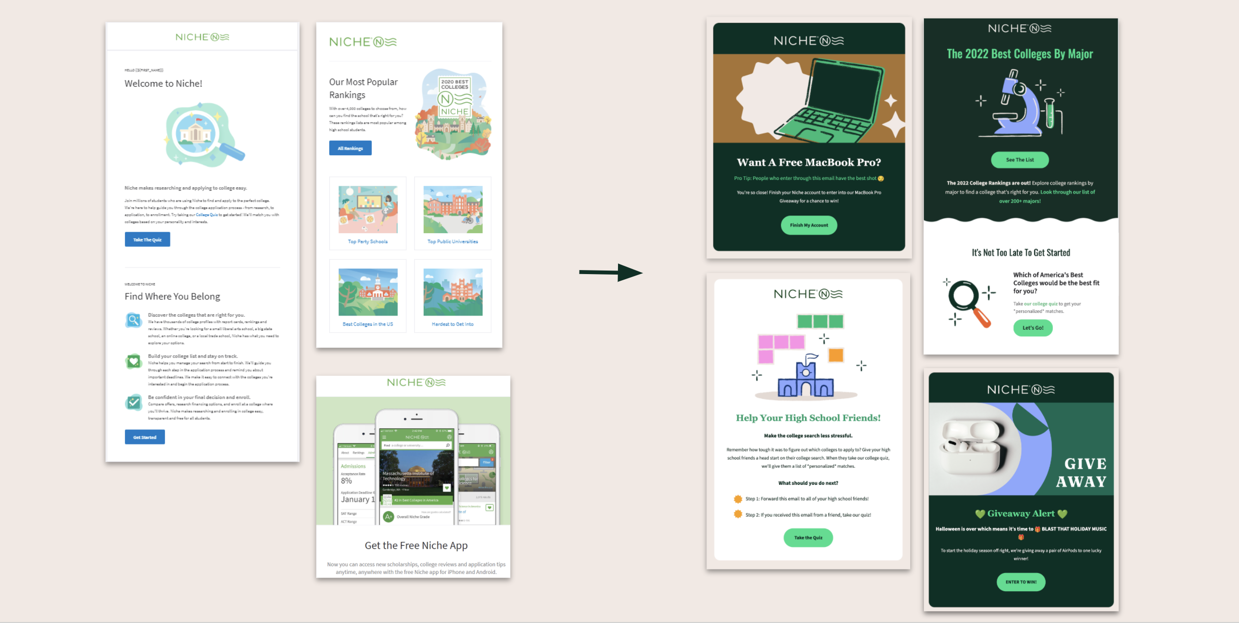
After creating our new brand guidelines we shared our new design assets with other departments.
I’ve created libraries of illustrations and other design assets, using Lingo, in order to pass design elements quickly over to my team or those outside of our department. Here you can download the assets in different filetypes (PNG, SVG, EPS).

